Radiant LUX
by starlightgs
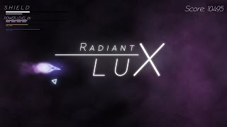
Radiant LUX is an abstract 2D shooter with gameplay based on colors :)
Here is the basic concept: destroy enemies of a color, and you level up your attack/shot of that color. You also deal more damage to enemies if you match that shot to the enemy's color.
You start out in the Red refraction, which spawns red enemies. However, occasionaly an enemy of a different color will appear. Kill that intruder, and a portal will spawn that leads to his refraction, which spawns enemies of that other color. That way you can get a new attack from that color and level it up.
Also, after gathering a few levels in different colors, a boss will appear. These bosses are made of several, multi-colored parts. And, remembering you deal more damage hitting stuff with shots of the same color, you can make use of that to your advantage.
Sounds neat? play the demo and ROAST IT :D
And if you like it, PLEASE click on the link on the right for the Greenlight Page, and leave a YES vote. We need all the votes we can get, so this would be the BEST contribution <3
- 3 more colors, with unique attacks and abilites: ORANGE, VIOLET and YELLOW
- More enemy bits - The demo only assembles enemies with triangles and squares, final game will add 6 more forms, each different with attacks and abilities.
- MANY, MANY more boss attack patterns. Watch out for some COOL BULLET HELL PATTERNS :D
- Story mode / Tutorial with cutscenes and ending. I'll leave the details as a surprise ;)
- levels from 5-10 to all 6 colors, including MAGNA ATTACKS at level 10 - really powerful shots capable of wrecking havoc on many enemies at once.
Roasts
mementogames 7 years ago
Game Graphics MechanicsThe core of the game, using colors, seems to be a pretty good idea.
However, I found kinda easy to win the game by just spamming any shot color. Maybe you could nerf hitting enemies with different colors?
Or maybe add another kind of penalty?
starlightgs 7 years ago
I Updated the build in the itch.io page, http://starlightgs.itch.io/radiantluxwanna give it a try? :)
farflunggames 7 years ago
I think you should remove any old builds that people can still find anywhere else.farflunggames 7 years ago
Game Graphics Tutorial/Learning CurveI'm writing this as someone who played the game for 10 minutes, so keep that in mind.
Firstly, I feel the ship was moving a bit too fast and twitchy. This is minor, because I'm sure others will disagree and you will need to find the correct setting that will make your target audience happy.
The bigger problem for me was that I just didn't know what was going on. I'm shooting some enemies, jumping portals, etc. But it felt unstructured and I didn't know the "rules" or what I was supposed to achieve or how to achieve it. For example, I have no idea how or why I got the blue laser. I think what's missing is easing the player into the world and explaining how things work with some kind of tutorial. More of a structured Missions approach, where Mission 1 is using one weapon and one background colour. Mission 2 brings in the first portal jump, explaining it. And so on.
Another minor point is that when playing on the XBox One controller, the red B button matches the red bullets, but the green A button is used for the blue laser. Would be nice to match these up.
Hope this helps!
starlightgs 7 years ago
Hi! Thanks for roasting my game :)From your roast, I'd wager you skipped the disclaimer text I put in when you start playing, hahahahahah :). I wrote (even did it colorful letters as to draw attention) that a tutorial is planned for the launch version, but for now I prepared a README file outlining the gameplay. I suppose I need something flashier for that...
As for the controller, that's funny, I was quite sure that I matched colors with the buttons. Will revise that and release a quick fix. Thanks for pointing it out!
As for the ship speed, yeah, so many tweaks went there already, and so many more will be made. Thanks for the pointer.
If you wanna follow the development, send in a vote and follow the game at the greenlight page at http://sgstudio.net.br/RLUX_Greenlight :)
Thanks a lot for your interest! ^^
Hellbound 7 years ago
Game Graphics Tutorial/Learning Curvestarlightgs 7 years ago
It didn't? now that's odd. I'll take a look on it.Also, I'm quite sure to have gotten rid of older builds, but... did your build feature a "press C for controls" message on the bottom of the screen?


